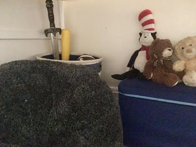
I didn't think I had it in me, but painting, sanding things down, and transforming furniture pieces and different spaces makes me feel very accomplished! Apparently I missed my calling as an Interior Designer.
I used minimal paint for the room since I had these cool peel-and-stick triangles sticker thingys that I wanted to use all over the walls. Also, it's such a quick way to transform a space -- it literally took me 10 minutes to put them up! I still may go back to paint the walls at a later time, but for now... white it is!
Because the room isn't large and the closets practically take up one full wall... and I wanted to keep Aiden's lofted Ikea Kura bed, I decided to paint the bed white. Ya know, to make it seem less bulky and sleek and whatnot. (At least that's what the design expects say to do.)
Here's a picture of what the bed looked like before:
I removed the letters A-I-D-E-N and the toy car, wiped down, sanded, and painted that bad boy with three coats of white paint. (Thank you YouTube and all the design blogs out there for hooking a sistah up!)
I kept some of his storage baskets and toy chest because the kid has mad toys and puzzles and
Then I threw some chalkboard paint up on some of the closet doors, hung up the kids' art work here and there, and voila! The #BROS room was made!
With the wall space and storage space above the closets, it was really fun designing different areas of the room. It all ties together, but they definitely feel like distinct spaces within the space. (Ha! I sound like an Interior Designer already!)
Also, I learned that the key to making spaces shine in pictures is... close ups. Seriously! It's makes a world of difference when showcasing a space.
Filed under: Things no one tells you about decorating and designs and pics and ish. #MindBlown
The big challenge was fitting Aiden's lofted bed and August's crib in the space, which took some navigating and moving things around several times before I settled on this current layout. I totally overestimated how much space the room had when I toured the apartment so next time I'll use measuring tape for things like this.
Another (less big) challenge was hiding the door that connects the boy's room to the master bedroom because I do not want them as extended roommate. Which is why the navy curtain is so important.
A third (more obvious) challenge was the shared space challenge. Space ain't all that full and plentiful in NYC so these bros had to share a room. And I wanted to make the space feel fun enough for a toddler, yet cool enough for a 10-year-old.
Mission accomplished, I think.
What are your thoughts on the space? Also, who wants to come help me paint the entry way hallway, master bedroom, and kitchen?


This look greats, I never would have guessed there was a door behind that curtain. Framing the artwork also makes it look so grand and special! What a cute touch.
ReplyDeleteAnd Im running from a standard users account with strict limitations, which I think may be the limiting factor, but Im running the cmd as the system I am currently working on. casa putas ibiza
ReplyDelete